- Photo Safaris
- Alaska Bears & Puffins World's best Alaskan Coastal Brown Bear photo experience. Small group size, idyllic location, deluxe lodging, and Puffins!
- Participant Guestbook & Testimonials Candid Feedback from our participants over the years from our photo safaris, tours and workshops. We don't think there is any better way to evaluate a possible trip or workshop than to find out what others thought.
- Custom Photo Tours, Safaris and Personal Instruction Over the years we've found that many of our clients & friends want to participate in one of our trips but the dates we've scheduled just don't work for them or they'd like a customized trip for their family or friends.
- Myanmar (Burma) Photo Tour Myanmar (Burma) Photo Tour December 2017 -- with Angkor Wat option
- Reviews Go hands-on
- Camera Reviews Hands-on with our favorite cameras
- Lens reviews Lenses tested
- Photo Accessories Reviews Reviews of useful Photo and Camera Accessories of interest to our readers
- Useful Tools & Gadgets Handy tools and gadgets we've found useful or essential in our work and want to share with you.
- What's In My Camera Bag The gear David Cardinal shoots with in the field and recommends, including bags and tools, and why
- Articles About photography
- Getting Started Some photography basics
- Travel photography lesson 1: Learning your camera Top skills you should learn before heading off on a trip
- Choosing a Colorspace Picking the right colorspace is essential for a proper workflow. We walk you through your options.
- Understanding Dynamic Range Understanding Dynamic Range
- Landscape Photography Tips from Yosemite Landscape Photography, It's All About Contrast
- Introduction to Shooting Raw Introduction to Raw Files and Raw Conversion by Dave Ryan
- Using Curves by Mike Russell Using Curves
- Copyright Registration Made Easy Copyright Registration Made Easy
- Guide to Image Resizing A Photographers' Guide to Image Resizing
- CCD Cleaning by Moose Peterson CCD Cleaning by Moose Peterson
- Profiling Your Printer Profiling Your Printer
- White Balance by Moose Peterson White Balance -- Are You RGB Savvy by Moose Peterson
- Photo Tips and Techniques Quick tips and pro tricks and techniques to rapidly improve your photography
- News Photo industry and related news and reviews from around the Internet, including from dpreview and CNET
- Getting Started Some photography basics
- Resources On the web
- My Camera Bag--What I Shoot With and Why The photo gear, travel equipment, clothing, bags and accessories that I shoot with and use and why.
- Datacolor Experts Blog Color gurus, including our own David Cardinal
- Amazon Affiliate Purchases made through this link help support our site and cost you absolutely nothing. Give it a try!
- Forums User to user
- Think Tank Photo Bags Intelligently designed photo bags that I love & rely on!
- Rent Lenses & Cameras Borrowlenses does a great job of providing timely services at a great price.
- Travel Insurance With the high cost of trips and possibility of medical issues abroad trip insurance is a must for peace of mind for overseas trips in particular.
- Moose Peterson's Site There isn't much that Moose doesn't know about nature and wildlife photography. You can't learn from anyone better.
- Journeys Unforgettable Africa Journeys Unforgettable -- Awesome African safari organizers. Let them know we sent you!
- Agoda International discounted hotel booking through Agoda
- Cardinal Photo Products on Zazzle A fun selection of great gift products made from a few of our favorite images.
- David Tobie's Gallery Innovative & creative art from the guy who knows more about color than nearly anyone else
- Galleries Our favorite images
Choosing a Colorspace–When to Go Large
Choosing a Colorspace–When to Go Large
Submitted by David Cardinal on Fri, 12/31/2010 - 11:22
 For most folks it is enough trouble to get their images sorted, filed and emailed or printed. But for the dedicated few who take the extra time to work on them in Photoshop it isn’t long before they stumble across the topic of colorspaces. Like most things in photography once you know about it you can find endless and often contradictory advice about what it is and how to deal with it. The topic came up again on our recent photo safari so I thought it would be a good time to help clarify things…
What’s a Colorspace, Anyway?
I’ll start with a simple definition of a color space. It is a map of the numeric values of the pixels in your image to “real world” colors. There are “small” color spaces like sRGB, which map your pixels into the least common denominator of color display found in inexpensive TVs and web browsers, “medium” color spaces like Adobe RGB which approximates the color fidelity you might find on a higher-end monitor or D-SLR and “large” color spaces like ProPhoto RGB (developed by Kodak) which can contain colors far beyond what we can currently capture or even see.
Why do I Care?
Unfortunately if you care what your images look like you need to care about colorspaces. Specifically if your image is encoded in one colorspace and displayed in a different one then it won’t look right. For example images encoded in Adobe RGB look washed out when displayed on an sRGB device.
But if all this is making your head spin you can “opt out” of this whole issue by simply choosing sRGB as your camera colorspace and your Photoshop colorspace and leave it at that. Then all your images will look okay on just about every device, as it is the smallest and therefore the “safest” default. So why wouldn’t you do that?
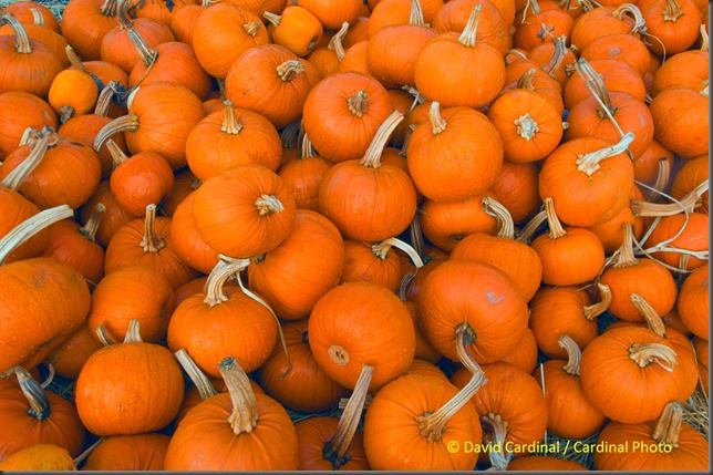
These pumpkins were out of gamut in sRGB, but fit perfectly in Adobe RGB
Simply because our world contains many colors that don’t fit in sRGB, and most D-SLRs, high-end monitors and high-end printers can now work with those colors. So if you want the richest and most accurate images you need to deal with at least a little color space complexity.

sRGB Gamut vs. Adobe RGB Gamut
Can’t I Just Use a Huge Color Space?
Yes, you certainly can. That’s what ProPhoto RGB is and if you browse fine art photography sites you’ll find plenty of folks who recommend you stick with it as the space you set in Photoshop (in Edit->Color Settings you can change the color space Photoshop uses by default, called its “working space”). There is just one kind of large issue with this approach. Because ProPhoto RGB is a huge space it requires a huge map to cover the territory. That means if you are going to be working in it you really should be using a 16-bit workflow—opening your images from Camera Raw into your Image Editor in 16-bits and saving them as 16-bit image files (really 48-bits per pixel, as each color gets 16-bits). That doubles the disk space your images need and slows down your processing dramatically. On top of that not all Photoshop plug-ins operate on 16-bit images.
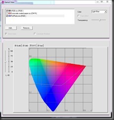
sRGB Gamut vs. ProPhoto RGB Gamut
If you’d like to learn more about 8-bit versus 16-bit workflow you can see the article we published in DPS 4-13 in 2007. Fortunately there is a way to tell when you need a truly large color space which I’ll get to later in this article. In the meantime the good news is that there is a really good choice for a general purpose working space.
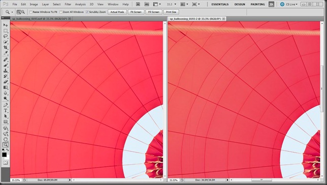
Hot-air Balloon in ProPhoto RGB vs. sRGB – Even though they were both later converted to sRGB for the web you can see the additional richness of the ProPhoto RGB version on the left.
Adobe RGB: The Goldilocks Colorspace
Adobe RGB turns out to be a really good all around colorspace. Most modern D-SLRs let you choose it as the colorspace they output when you write JPEG files and many newer monitors even let you set them to directly operate in it. And it is a convenient default for Photoshop and Lightroom. It is just about big enough to hold all the colors you’ll capture most of the time but small enough that you can typically get away with an 8-bit workflow—a good thing unless you have an unlimited budget for computers and disks.
To use Adobe RGB you need to do three simple things:
- Set your camera to record images in Adobe RGB (if you shoot Raw you also want to set your Camera Raw settings to output Adobe RGB)
- Set your Photoshop or Lightroom Working Space to Adobe RGB
- Remember when you send an image to anyone not using a fully color managed system (when it doubt assume they aren’t) convert the image to sRGB. Many programs like Photoshop and DigitalPro make this easy with a simple checkbox when you use commands to “convert” or “submit to web” your images.
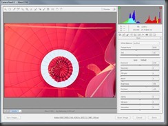

The screen shot on the left shows an out of gamut image in Camera Raw using sRGB.
The screen shot on the right shows the same image in gamut with ProPhoto RGB.
That’s all there is to it. If you forget step #3 your images will look washed out on other folks computers or when you send them off to a consumer online print service. That’s the price you pay for the extra rich colors of Adobe RGB. The only other trick is deciding when Adobe RGB isn’t big enough
When Adobe RGB Isn’t Enough: Move Over Goldilocks
Using Adobe RGB is as we’ve said, a compromise. For some images your camera will be capturing colors that are simply outside its range. And if you have a high-end printer it can even print many of those colors. But not if you put them through the bottleneck posed by Adobe RGB in the middle. So the trick is knowing when you have those colors in an image so you can kick it up a notch and use ProPhoto RGB & 16-bit processing.
There are many tools which help you look at the colors in an image but the good news is you’re probably already using the handiest. When you first set your Raw file options Adobe provides you with a handy histogram of the image. You are probably already using it to determine whether you have blown out highlights and need to use the Recovery slider. But it is good for a lot more than that. Since it is an RGB histogram it can tell you if a particular channel is saturated. And if looking at your image you realize the problem isn’t blown out whites but over-saturated colors that’s your tip to do a quick shift to ProPhoto RGB. The image below, for example, is of the inside of a hot air balloon and Adobe RGB just couldn’t contain the vivid red hues:
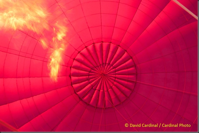
This hot-air balloon image was out of gamut in sRGB and Adobe RGB but rendered correctly in ProPhoto RGB.
Nikon D700, Sigma 24-70mm f/2.8 Lens
Switching to ProPhoto and 16-bit is easy. Simply click the “Options” link at the bottom of the Camera Raw screen and change the settings in the resulting dialog to ProPhoto RGB and 16-bit (don’t forget to change them back on your next image). If you’re right that the problem is over-saturated colors then you’ll see your histogram snap back into line without any nasty highlight and lowlight warnings. If it doesn’t then your problem may not be related to colors.
Once you’ve done that simply process your image as usual. The only caveat is that since your image has some really radical colors it may be hard to print in full fidelity. You’ll need to make extra sure to soft-proof through your printer profile to see how it renders the extreme hues and possibly do some tweaking in your image editor to make them come out the way you want on the printer. And you need to make extra sure that you convert the image to a smaller colorspace before sending it to anyone or it will look awful on their display.
That’s all there is to it. If you’d like to learn more I highly recommend Color Confidence: A Real World Guide To Color Management by Tim Grey. Real World Color Management is also excellent but hasn’t been updated since Bruce tragically passed away and is now a little dated and hard to find. Let us know any tips or tricks you have for making the most of your color management workflow and colorspace choices either here or in our Color Forum on nikondigital.org.
- Log in to post comments

